Brands with international fame and recognition have gone through many strategies to earn the results that they do. Starbucks is one of them. There were 27,339 Starbucks shops in the world in 2017 in Africa, Asia, Europe, North America, Oceania and South America. The Starbucks company has a logo which is so familiar to customers that it might even be used without the brand’s name. However, there’s much to the Starbucks logo history that graphic designers, marketers and website owners should take note of.
Key Moments from the Starbucks Logo History
Starbucks was founded back in 1971 as a small coffee shop in Seattle. Its free internet and unique coffee products have attracted customers from around the world. However, the siren logo has helped make the brand more powerful and iconic. The Starbucks logo history is a branding lesson that many of us should learn.
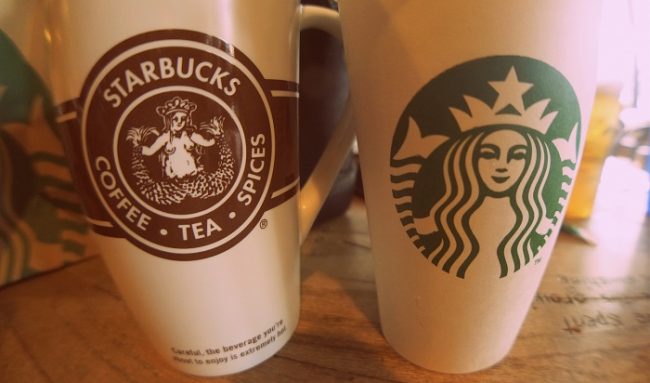
1971: The Starbucks first logo was a siren in a circle. The logo had more details about the siren, including bare breasts and a lower half with two split fish tails. Brown color was the original color of the logo, which changed after a few years.
1987: Starbuck’s logo became streamlined and changed its color to the signature dark green we now know. This is also the time when Starbucks began selling espresso beverages. The company name changed from Starbucks Coffee Tea Spices to Starbucks Coffee. The logo still featured two split fish tails.
1992: Starbucks became publicly traded in 1992 and rebranded for a friendlier look. This was another hotspot in the Starbucks logo history as the mermaid lost its lower half.
2011: The 2011 change is also the latest from the Starbucks logo history. The logo lost its writing and the circle lost its contour. Starbuck’s white mermaid is now on a green background instead of the black one. This update made the logo even more simple than before as it removed all excess colors, text and stars. This change also marked 40 years of company existence.
Symbols from the Starbucks Logo History
The brand owners got inspiration for their logo while researching through a book with old marine woodcuts. The mermaid was a symbol of Seattle’s history of a seaport. The stars were simply put in the Starbucks logo to fit the brand’s name.
The symbol of a two-tailed siren dates to the 8th century, as a mosaic in an Italian cathedral. As the siren’s lower half disappeared, branding specialists have wanted to keep its inspirational aspect as a muse. Therefore, they decided to make her face asymmetrical and cause an international stir. As Starbucks representatives claim, the mermaid’s right side of face has an extra shadow. Specialists explained this asymmetry by providing the logo with a friendlier, more human face that eliminates the mask feel.
According to the brand’s website, the latest Starbucks logo represents its tight connection to partners and customers.
Who Contributed to the Starbucks Logo History
- Howard Shultz, the brand’s executive chairman wanted to insert the green tone into the logo as a symbol for his former coffee shop.
- Graphic designer Terry Heckler was the first to sketch a logo for the Starbucks brand. At the time, the first logo was also the company’s first attempt to create a brand identity in a series of brainstorming sessions.
- The all-time used font from the Starbucks logo history was drawn by Joshua Darden. Even though it became bolder throughout the updates, the signature font has not gone through major changes.
- The concept of signature coffee came from journalist Gordon Bowker, together with entrepreneurs Heckler Associates who wanted to provide coffee with a concept.
Why the Starbucks Logo History is Impressive
The Starbucks brand became so famous that it became one of the cornerstones of American literature. Author Herman Melville introduced the branded coffee in Moby Dick. The brand has also tried to sell magazines and music albums throughout its evolution. Yet, the only successful product was coffee.
The Starbucks logo features a mermaid and no writing. Company officials say that the symbol comes from the 16th century, while historic proof place it in the 18th. Aside the historic Seattle, the brand’s logo seems to have a vague significance. There are some who develop theories about hidden meanings of the company logo. However, more discussion means more publicity.
Starbucks Wrap Up
The Starbucks logo history features 4 updates and a few branding and graphic design experts. The company had its ups and downs. Yet, it managed to exploit its international fame to the fullest and even create internet trends such as photos with people holding Starbucks cups.
Starbucks is a brand winning story that won’t end anytime soon. Since it’s still being written about, branding experts will be able to learn from the coffee company’s future initiatives.
Photo Credits
Starbucks Logo – Fair Use
Starbucks Cups – Wikimedia Creative Commons
Storefront – depositphotos
Guest Author Bio
Samuel Caverly
Samuel Caverly is the Senior Editor at Logo Realm, an online portal that provides informative articles on the origin, evolution, and significance of company logos.


Please Share Your Thoughts - Leave A Comment!