“What began it all was the bright bone of a dream I could barely hold onto.” — Michael Ondaatje, Running in the Family
“I’m for truth, no matter who tells it.” — Malcolm X, The Autobiography of Malcolm X
Maps cure us of the great fallacy that there is separation of imagination from reality. People often proclaim that within the calculus of truth there is no room for dreams, things imagined, or anything undocumented. The map is thus a great equalizer, taking in everything, like love does, and giving us worlds wholly human and complete in themselves.
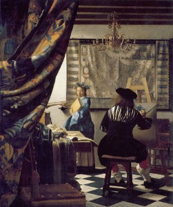 The painter Vermeer knew this well. He repeatedly included a map of the United Netherlands in his paintings, even though the republic ceased to exist long before his last brushstroke.
The map in his paintings takes many forms. In A Girl Asleep, there is only the bottom pole and a small strip of the map’s parchment. Woman in Blue Reading a Letter shows about half of it, but the boundaries are blurred into a sea of gray and brown. About a third of a blurred map is shown in Young Woman with a Jug. In The Art of Painting, the map is whole. However, it is not only blurred, but also wrinkled and cracked.
It is only in Officer and Laughing Girl that we finally see it all: a whole map with the provinces of the Netherlands painted in clearly. Each of these maps is an artistic copy from an original. They may all be different maps, but what makes their separateness disappear is their collective birth from Vermeer’s imagination.
Vermeer was only 16 years old in 1648, the year the Netherlands was formally divided into northern and southern provinces. His art, then, may have been an attempt to reunite a divided culture. Vermeer saw a rapidly changing world outside, so he painted a more stable one inside. This may have had everything to do with his love of maps, or maybe nothing at all. It doesn’t really matter.
Vermeer’s maps are like his windows. Each is an entryway into his home, as well as a way out into the world. As such, they are visual autobiographies, icons that tell us something about the life of the artist. Autobiography – like art, maps and love – blurs the line between reality and imagination — what’s real and what is imagined.
Like Vermeer, the work of late 13th century mapmaker Richard of Holdingham is, among other things, a great autobiography. Very little is factually known about his life.
 There was a Richard of Battle, who was a rector in Kent in 1260, and went on to be a cleric who received a salary from church revenues until at least 1277. Later, from 1305 to his death in 1326, Richard of Battle was a canon of Hereford and prebendary of Norton.
Historian P.D.A. Harvey wrote of him, “…if Battle was his family name, Holdingham might well have been where he was born or lived, and such an alternative surname would be normal at this time.”
Indeed, there was a place named Holdingham, a village located near Lincolnshire, in England. Beyond dates and places of possible residence, there are only two other things known about Richard of Battle: he received a gift of venison in 1289 or 1290, and he paid some money to an unnamed servant.
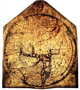
This is not much to go on, is it? Indeed, it could even be the story of the wrong man. There is no way of knowing. Historians have given us the merger of Richard of Battle with Richard of Holdingham as truth. However, the only definite account of Richard of Holdingham is in the map he left behind: The Hereford Map.
Judging from the map, the life of Richard of Holdingham must have been one of many loves: animals, both real and imaginary, are as common as crabgrass in an open field. Buildings, crudely drawn and mostly two-dimensional, are even more common. Rivers, like single strands jutting from several great root systems, split the land into uneven slivers. And people, many in imaginary forms, are found standing, sitting, speaking, and striking each other.
Harvey suggests that, “The bulk of the general information on the Hereford Map comes from nine classical and later Latin authors,” and yet above all else, the Hereford Map is a devotional to the Christian God. Christ, the son of God, presides at the top of the map over a court of angels. Biblical stories are scattered throughout and the map is orientated so that Jerusalem, the birthplace of Christianity, is in the center.
This is not an accurate depiction of the world; it is a meditation on God, and the world God has created. Yet it was also the way people during those time navigated the world they lived in, which leads to the question “What is true anyway?”
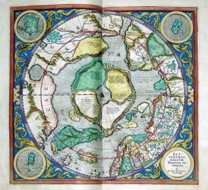 About two centuries after the Hereford Map, the famous Renaissance cartographer Gerardus Mercator defined his “atlas” as “cosmographical meditations upon the creation of the universe, and the universe as created.” This definition embodies the spirit of autobiography.
First, there is meditation: a human activity done in order to see beyond the visible, material world. Second, there is “the universe as created,” which signals Mercator’s desire to be accurate to concrete reality in his maps. Since autobiography is about life in its totality, it must contain both of these activities.
In the case of the Hereford Map, Richard of Holdingham dispenses with visual accuracy to show a greater one: the world as it is ordered the spiritual. Mercator takes his work one step higher, blending visual accuracy (at least to some degree) with spiritual accuracy, producing a different kind of autobiographical statement.
In Elizabeth Bishop’s poem Questions of Travel, she asks, “Oh, must we dream our dreams / and have them, too?” Over and over again, maps have answered, “Yes!”
This is a truth that even the most “scientific” of maps has accepted. We humans dream and then we draw. There is no way to separate the two. Just look at the legend of Prester John, another reality found on several centuries of maps, beginning before the production of the Hereford Map and extending through the era of Vermeer.
In 1122, a priest named Giovanni is said to have given Pope Calixtus II the first known account of Prester John. Twenty-three years later, while making an appeal for military aid to the Pope, Bishop Hugh of Jabala reportedly called Prester John “a direct descendant of the Magi.” Furthermore, he said that Prester John’s troops had recently emerged victorious from “a most bloodthirsty battle” with the Persians, and needed help to continue the good fight.
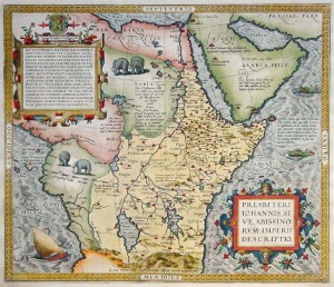 Not long after this, a letter, reportedly written by Prester John, began circulating across Europe. In it, Prester John claims to “exceed in riches, virtue, and power all creatures who dwell under heaven.” He tells of 72 kings who “pay tribute” to him, and of his “great army,” which is ready to “wage war against and chastise the enemies of the cross.” He may have been a fictional character, but to blood-thirsty, medieval Christian crusaders Prester John was absolutely a real man, a hero even.
Indeed, it is likely that Prester John is solely a product of the Christian crusades. His story, for example, began appearing in the middle of the crusades, just when the fires of zealousness were fading enough to warrant some more fuel. In addition, he was said to be the ruler of a powerful Christian kingdom in the heart of the non-Christian world.
His kingdom spent several centuries in Asia or Africa, sometimes engulfing both on the maps, before finally disappearing altogether in the 17th century. He was thus, for several centuries, both everywhere and nowhere, a king without a kingdom. Even if he factually existed as a man, Prester John was, more than anything else, an autobiography of the medieval European imagination.
We like to think today that the maps we produce are factual, accurate, scientific even. And to some extent, that’s certainly true. Gone are the days of guessing about the shape of entire continents, whether the world is flat or round, and how large the oceans and seas are.
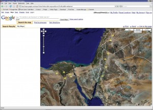 However, even if you only take a political angle, it’s easy to see the subjectivity that continues to be present in mapmaking. Is Tibet its own nation or an “autonomous region” of China? How do you approach mapping Ethiopia, knowing that it contains at least two regions claimed by ethnic minorities as separate “nations”? And how can you possibly map places like the West Bank or Gaza Strip objectively, knowing that every line drawn is also setting down a particular political narrative as well?
If we can learn anything from the great maps of yesterday, it’s that there is no such thing as pure objectivity in a human-made object. And not only is that not terrible news, but it can be grounds for celebrating the wholeness of human life, warts and all.
The next time you are on Mapquest, or Google Maps, take a moment to reflect on the fact that what you see was made by someone, maybe a team of someones. And even though the maps appear to be solely designed for utilitarian use, there still are signs, if you look very, very closely, of human autobiographies. For the act of mapping, for all its terrible uses throughout history, is still, in the end, at least partly an act of love.
Photo Credits
“The Art of Painting” by Johannes Vermeer
“Antique Map of Prester John” by Ortelius
Google Maps


I absolutely love the way you ended the article: For the act of mapping, for all its terrible uses throughout history, is still, in the end, at least partly an act of love. Thanks for a great read!
Hi Nathan,
A fascinating read! Thanks so much. I wonder if you are aware of the Piri Reis map?
It has been the subject of much speculation. It is a superb map complied in 1513.
Have a peek when you have a moment.
http://en.wikipedia.org/wiki/Piri_Reis_map
Cheers,
Gil
Thanks Gil. I have seen the Reis map before, but will have to read up on it now that you pointed it out.
Nathan